Art Originals | By Rissa Calica | 2026-05-11
Free of Gravity by Rissa Calica: A Collector's Essay on release and courage
A close ArtLoft reading of Free of Gravity, where release, courage, and the body's memory of flight become a living language for collectors.
View Free of Gravity Product Page
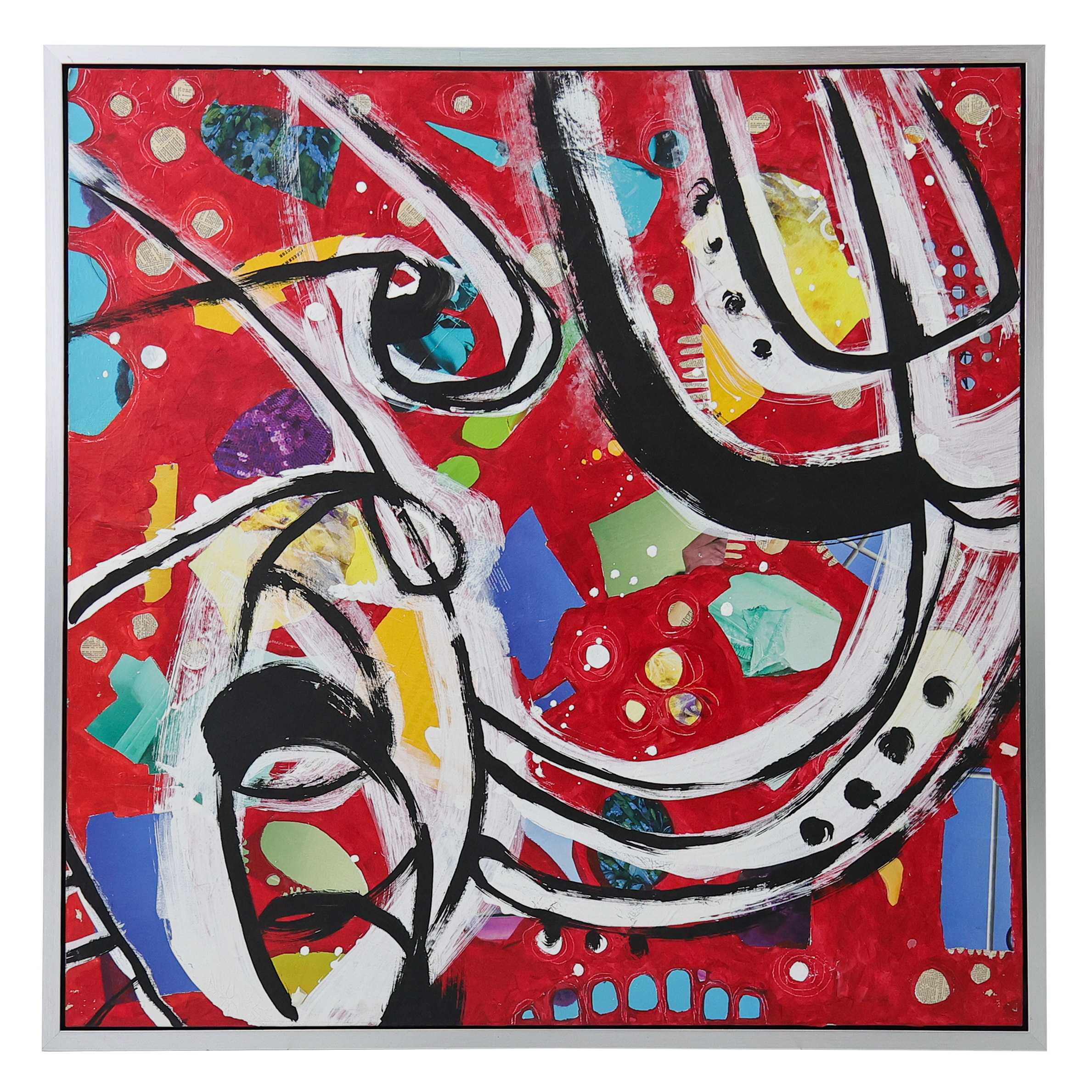
Free of Gravity begins with a red field crossed by arcs and color that feel airborne, even when the eye returns to the canvas. Rissa Calica does not ask the work to explain itself in a single glance. It opens through sweeping marks, ignition points, and a charged relation between ground and lift, giving the viewer an encounter that is immediate first and interpretive afterward. That order matters. The best collector essays do not press meaning onto an artwork from outside. They listen for what the work is already doing and then name it with care.
In this original, the central feeling is release, courage, and the body's memory of flight. The work carries gestures that rise against weight, but it does not reduce that idea to illustration. It lets symbol, surface, and atmosphere hold one another in tension. A collector approaching Free of Gravity is not simply choosing a beautiful object. The deeper choice is a kind of attention: the desire to live with something that keeps returning the eye to feeling, memory, and form.
What the Work Holds
The title gives the first key. Free of Gravity is memorable because it feels specific before it feels explanatory. It creates a handle for the imagination, the way the strongest artworks often do. A viewer can remember the name, then return to the surface and find that the title has not exhausted the experience. Instead, it keeps widening. Release, courage, and the body's memory of flight become less like subjects and more like conditions inside the work.
This is where the article language matters. The work should not be flattened into a product description or a decorative mood. It deserves a reading that can hold visual pleasure and inner consequence together. Free of Gravity has that capacity. It can meet the collector who first responds to color, shape, or texture, and it can stay with the collector who later wants to understand why the piece continues to feel necessary.
Material and Presence
Hybrid media on canvas is not a neutral fact here. the mixed surface keeps liberation from becoming weightless fantasy; it is freedom with texture and consequence. The material gives the work its way of being in the room. It affects how light sits on the surface, how the image carries weight, and how the viewer senses the distance between hand, process, and finished object. Material is one of the reasons an original can keep its authority after the first attraction has passed.
At 46 x 46 in., Free of Gravity also has a clear physical identity. Scale changes how meaning behaves. A larger work can create atmosphere around the body; a smaller work can train the body toward intimacy. This piece understands its scale as part of its voice. It does not need to borrow drama from outside itself because its presence is already built through proportion, surface, and restraint.
Why It Belongs in a Collection
Its force belongs in a collection that welcomes expressive confidence and emotional risk. Serious collecting begins where taste and recognition meet. Taste says, "I want to live with this." Recognition says, "This work has a language of its own." The strongest acquisitions often hold both responses at once. They are not only visually satisfying; they can be spoken about, remembered, and returned to with increasing precision.
That is why Free of Gravity belongs on ArtLoft's blog as a full essay rather than a short note. A collector needs more than inventory facts. The essay gives the work a context equal to its ambition: title, material, feeling, and room all entering the same sentence. Clear writing becomes a form of care here, not an advertisement; it gives the artwork enough space to be met before it is judged. This does not promise a market outcome. It does something more durable for the collector: it clarifies why the artwork matters as an object of attention.
How It Lives in a Room
Free of Gravity would be especially compelling in a high-energy salon, music room, or bold hallway where motion can expand the architecture. Placement is not only interior design. It is interpretation. The room tells an artwork what kind of daily life it will join, while the artwork quietly changes the room's emotional weather. Some pieces command a space by force. This one creates a more lasting influence by teaching the room how to hold release.
This is also where discoverability can remain honest. A reader may arrive through interest in hybrid media on canvas, Rissa Calica, original art, sustainable fine art, or abstract resonance. The article should make all of those paths feel natural because they are genuinely present in the work. The writing does not need to announce its usefulness. It only needs to make the artwork easier to see.
Abstract Resonance
Abstract resonance is the felt relationship between form, material, space, and emotion. In Free of Gravity, that resonance gathers through sweeping marks, ignition points, and a charged relation between ground and lift. Nothing has to be overexplained for the work to become legible. The viewer can begin with sensation, then move toward meaning. That movement from looking to recognition is one of the quiet pleasures of collecting.
Free of Gravity does not deny weight. It remembers it, then shows what release can look like. The work leaves a collector with language, but not with finality. It keeps enough mystery to remain alive in the room. That is the difference between an artwork that decorates a wall and an artwork that slowly becomes part of a life.