ArtSoie | By ArtLoft Editorial |
What Makes Mulberry Silk Distinctive for Fine Art?
Why ArtSoie uses a material known for lightness, luster, drape, and its unusually intimate relationship with color.
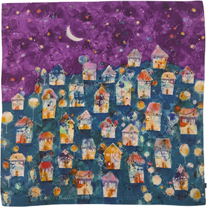
The surface changes with the viewer
Mulberry silk does not return light evenly. A color that looks deep from the front may brighten when the fabric bends or the viewer steps to one side. That shift can give a printed image more visual depth, but it also means a photograph never tells the whole story.
Low weight affects movement
Silk can carry a large image without the mass of a rigid panel. In Veatro, that lightness allows ArtSoie to respond to modest changes in the room. The same quality makes handling more intimate and more demanding. Rings, rough surfaces and rushed folding matter.
Drape introduces another composition
An image printed on silk does not remain one perfect rectangle in every state. Folds can hide one passage and bring another forward. Artists and printers therefore have to consider whether the original composition survives flat display, movement and approved wear.
Material prestige is not enough
The phrase 100% mulberry silk identifies the fiber used by ArtSoie. It does not answer every question about weave, print, finish or longevity. Ask for the edition-specific material record and care instructions. Look closely at edges and hand-finished areas rather than relying on the material name alone.
The collector's test is simple
View the silk flat, gently draped and under more than one light angle. If possible, compare the image with its source artwork. The material should deepen the encounter without making the artist's work disappear behind luxury vocabulary.
Sources and editorial notes
ArtLoft ArtSoie material specifications, reviewed July 2026
ArtLoft print and finishing archive
Reviewed by ArtLoft Editorial. Materially updated 2026-07-12. Read the editorial policy.